Lesson 7 - Posts with More Images
Folder structure
Notice how this post is in its own folder? That's going to help you reference images that aren't just the featured image.
Full-width images
Creating a full width image uses a similar syntax to links, but with an exclamation point at the beginning:

Note that the filename starts with ./ unlike the filenames we've been using for the featured images. That tells the site that it's in the current folder.
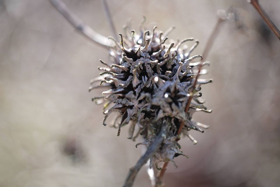
Here's a full-width image:
Inset images
However, you'll probably want images that take up smaller amounts of space on the page, with text flowing around them. This will require HTML syntax rather than Markdown, and will look like the following:
Text placed after the image will flow around the image, first staying to one side of the image and then filling the full width of the page once the image finishes. It's very important to remember that it is the text after the image.
Headers after inset images
As you might notice, headers do not reset the flow of the text around the image - however, this can be set to happen if you'd prefer (just ask!).
More images following an inset image, then text
New images, on the other hand, will sit fully below the previous image. This can also be changed! But you'll notice (on a wide screen, anyway), that this text still flows around image 1 before flowing around image 2.
Horizontal rules sit below inset images
If you really want to put anything fully after an image, you can first insert a horizontal rule (as mentioned in Lesson 1):
Now anything following that bar will sit below the image. This behavior can also be changed. Seriously, basically all of this can be changed. Just talk to me.
Inset images on mobile
If you check this out on mobile, the inset images will no longer be inset, and will instead be full width.
 Lesson 0 - Front Matter and URLs